2025
Treelink
BRANDING
CLIENTTreelink
MISSIONS
Art directionGraphic design
WORK
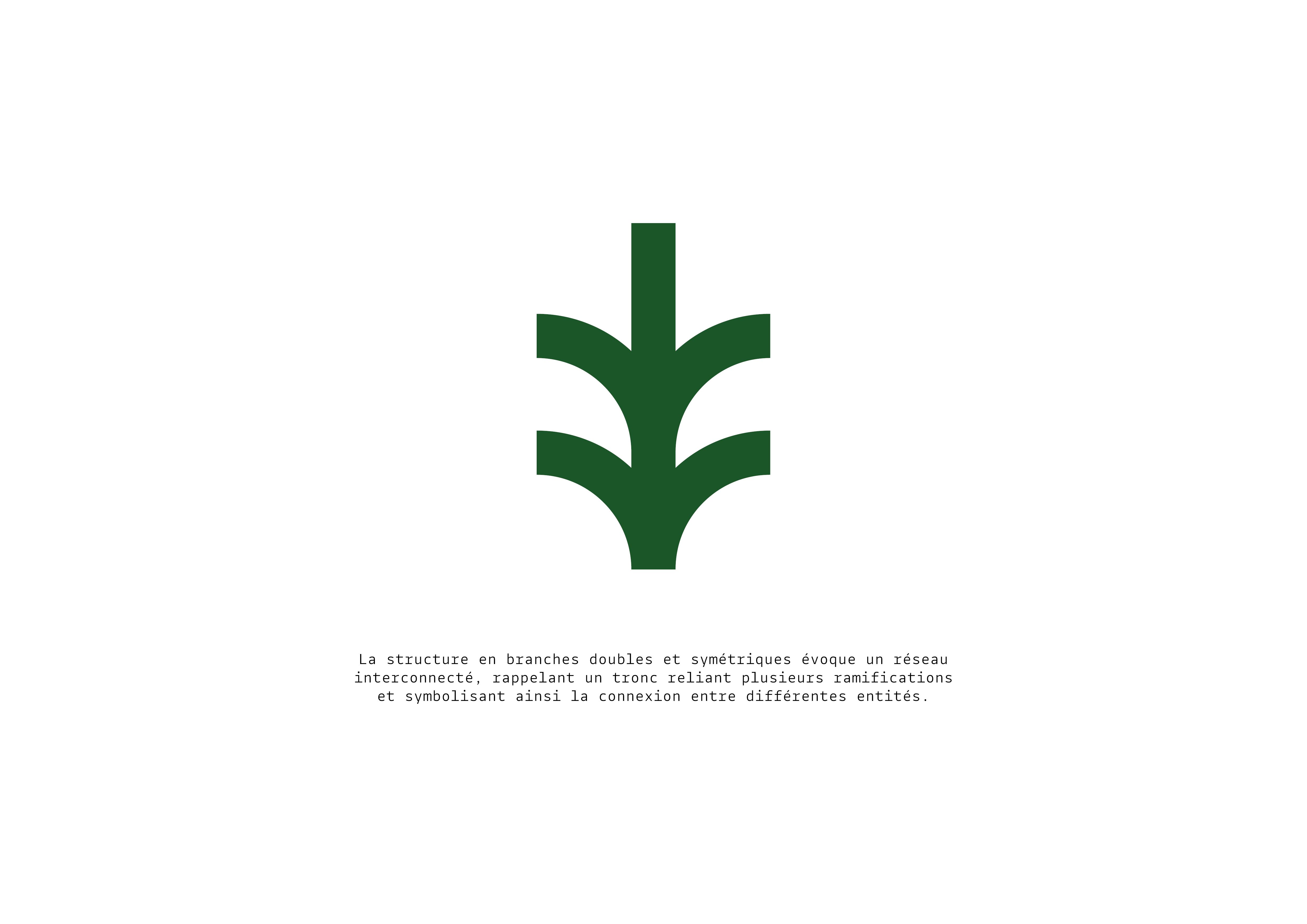
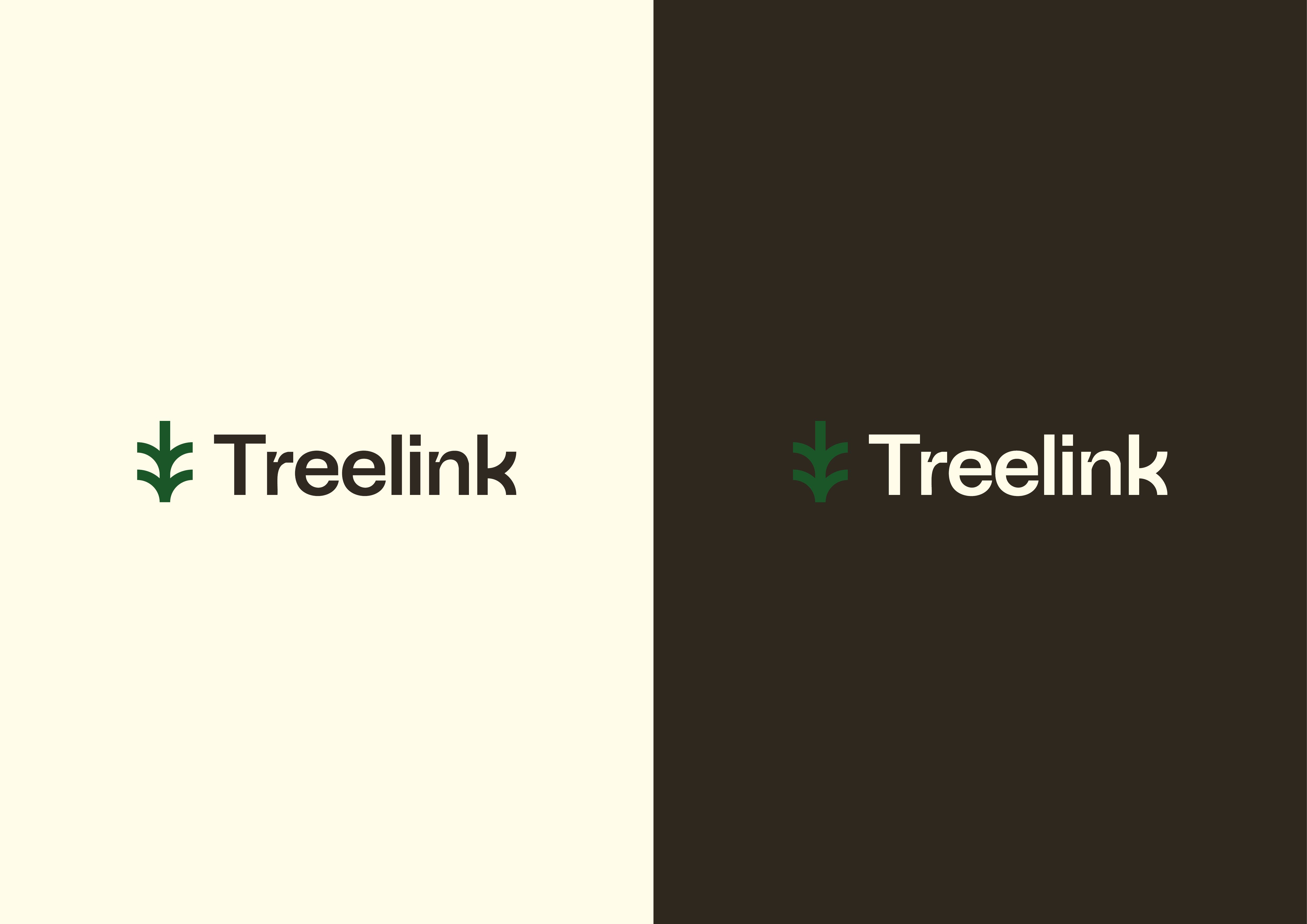
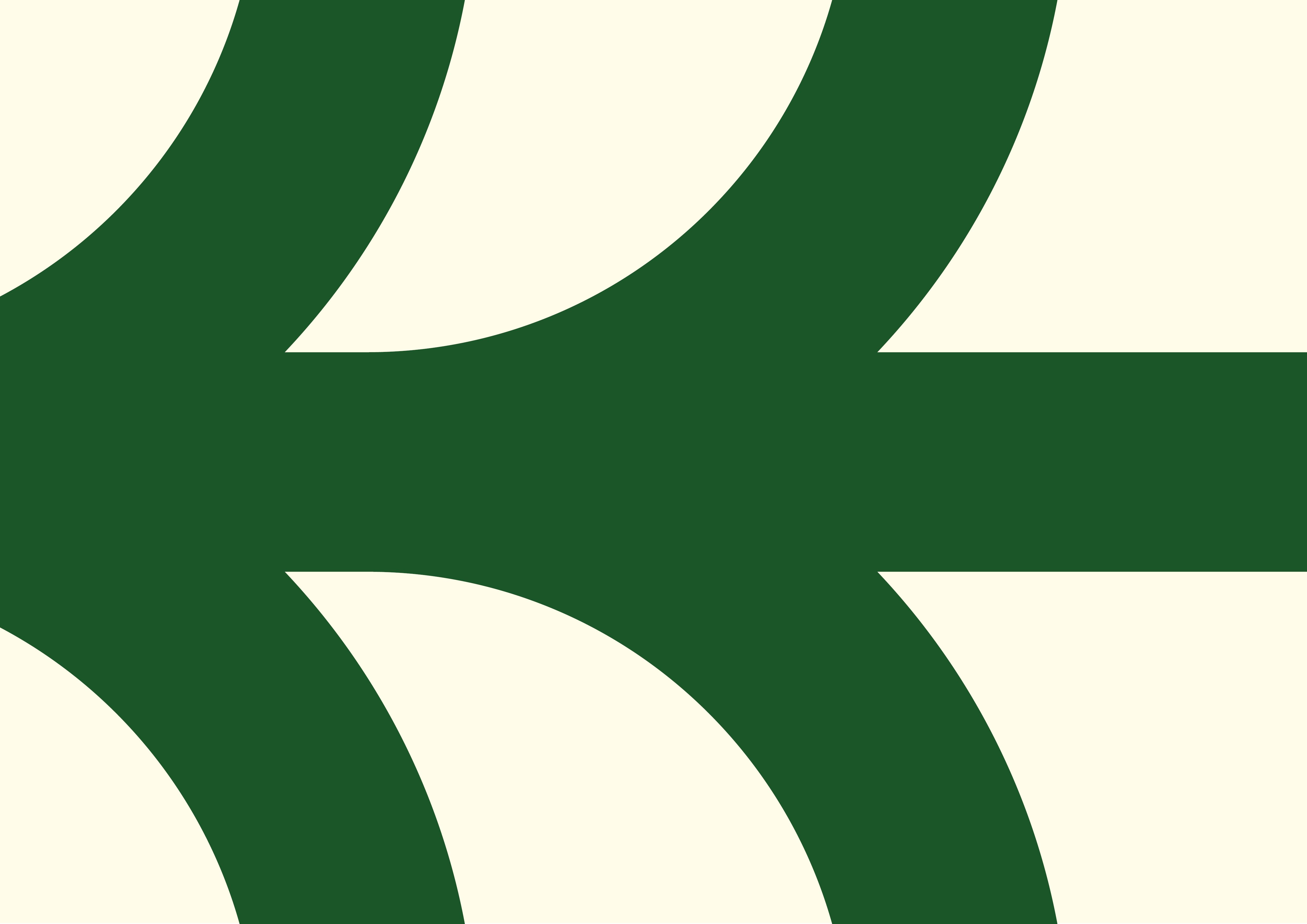
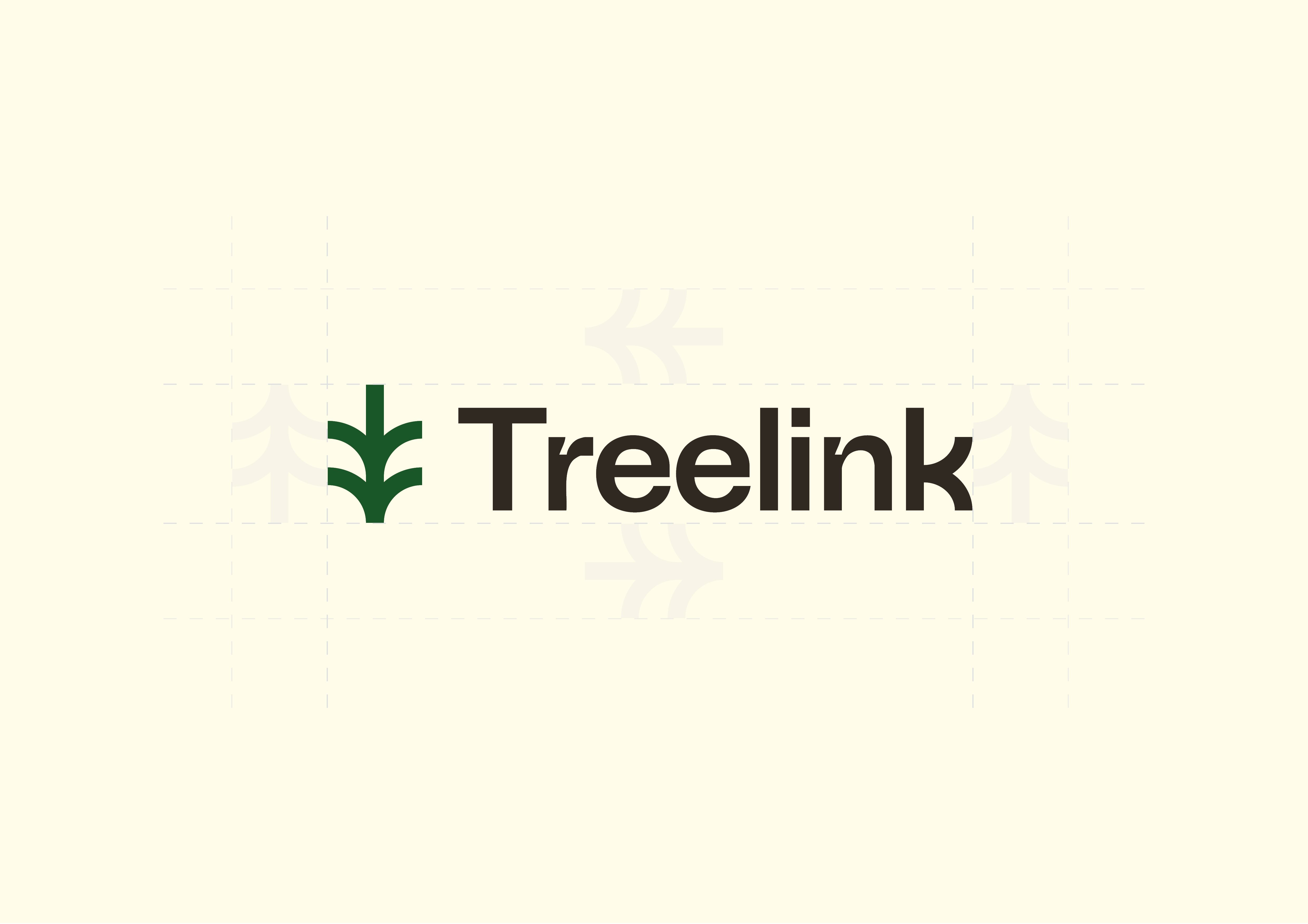
This branding project for a web developer centres on a sprout-shaped logo, whose twin, symmetrical branches evoke an interconnected network – a symbol of connection and growth. The natural, wood-inspired colour palette lends warmth and authenticity, complemented by a technical typeface with ink traps that highlights the digital and structured nature of the profession. Together, these elements create a balanced visual identity that is both human and technological, faithful to the client’s inspirations and vision.
Unfortunately, this project has not been taken forward.