2026
Shiro
BRANDING
CLIENTCélian Chevereau
MISSIONS
Art directionGraphic design
WORK
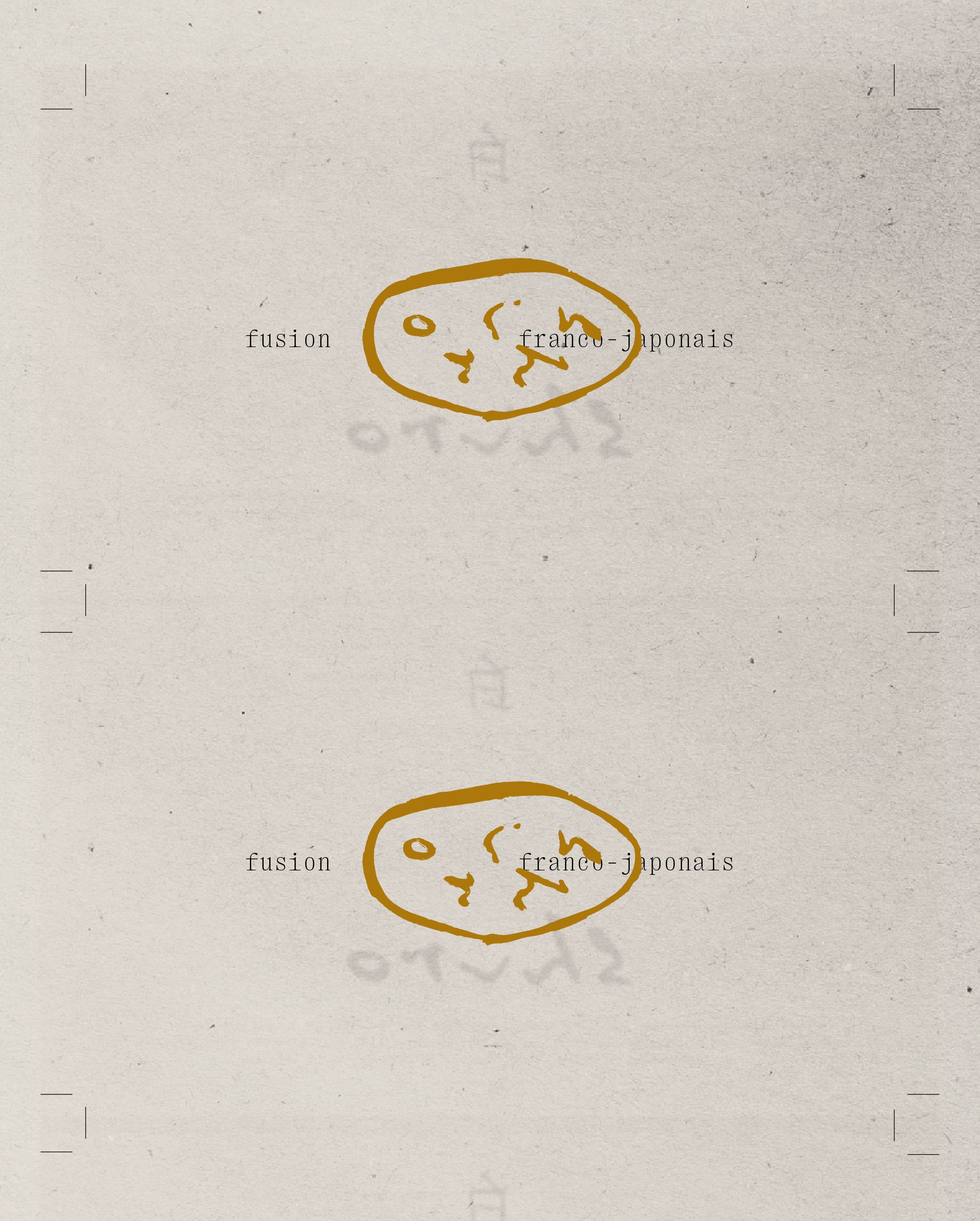
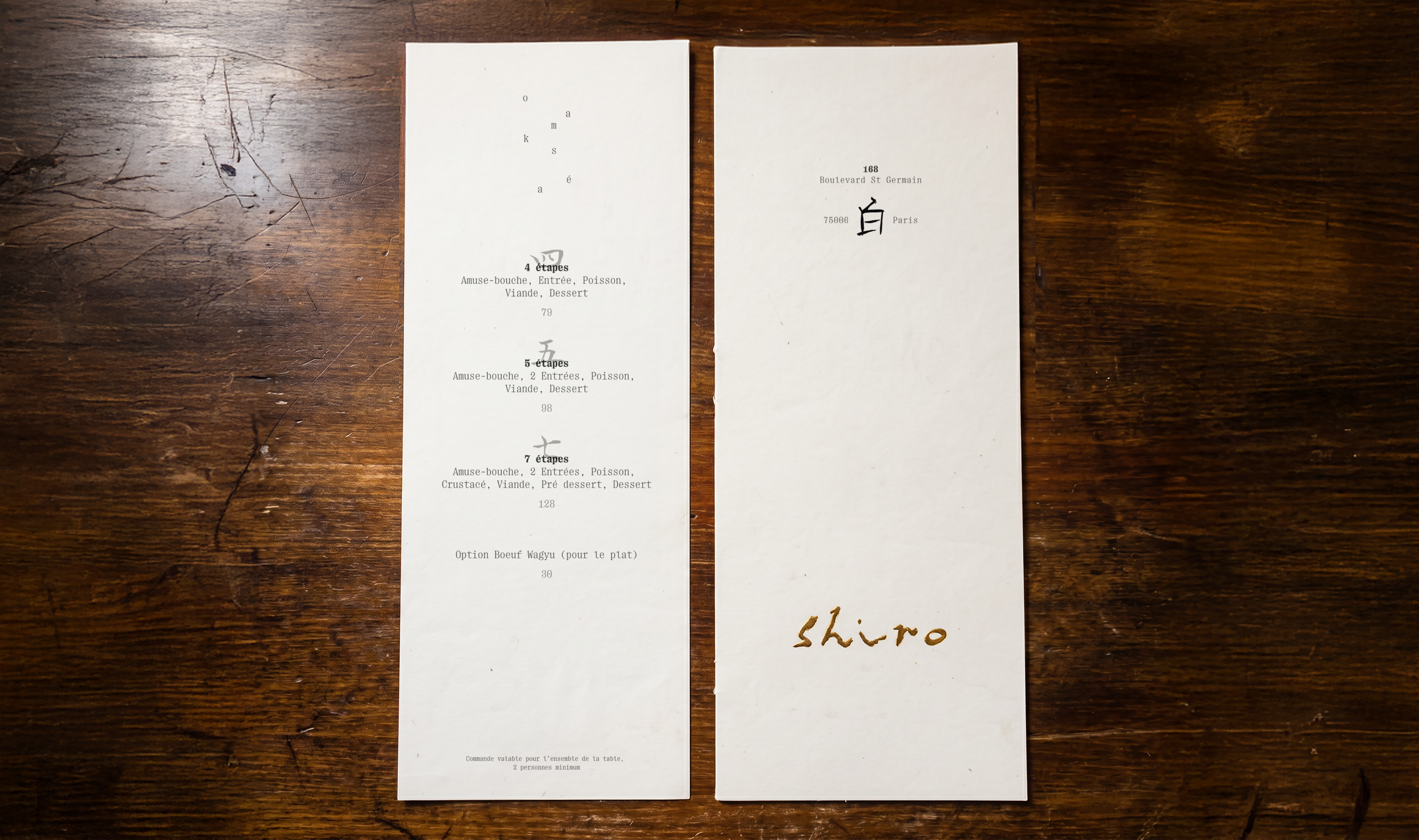
Shiro means "white" in Japanese. The restaurant is a franco-Japanese fusion table in Paris, where French gastronomic technique meets Japanese influence, and the identity reflects that duality without forcing it.
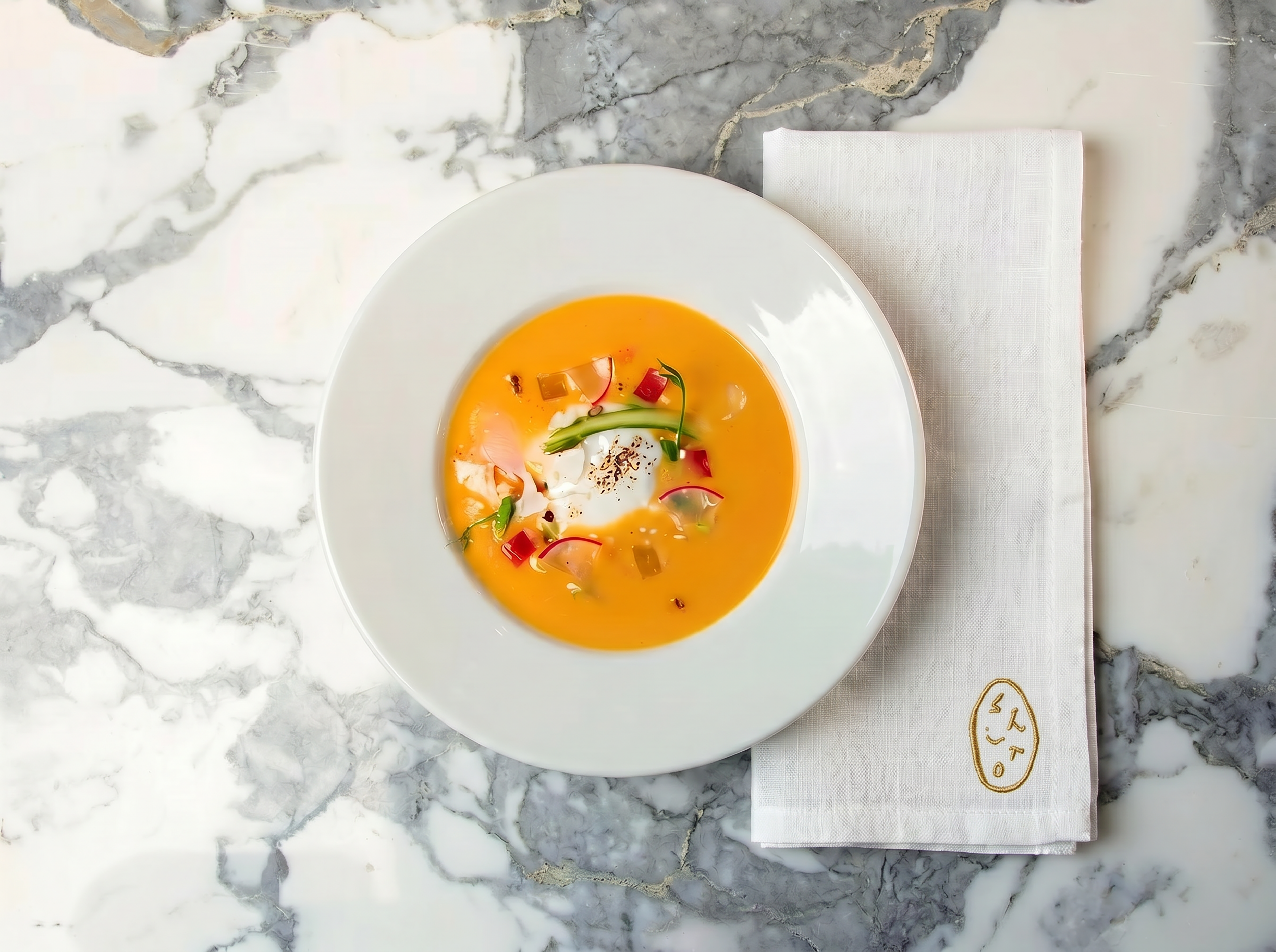
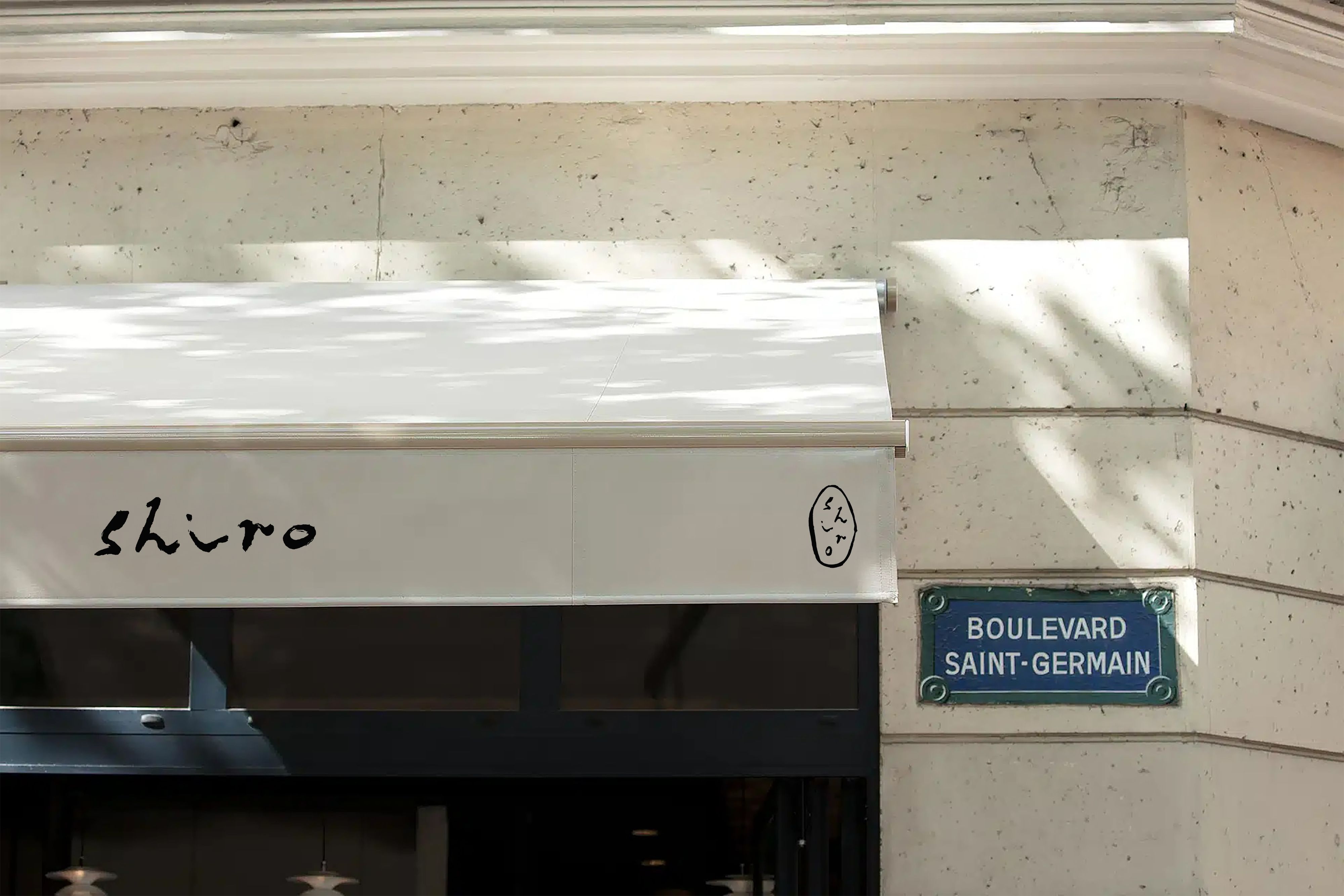
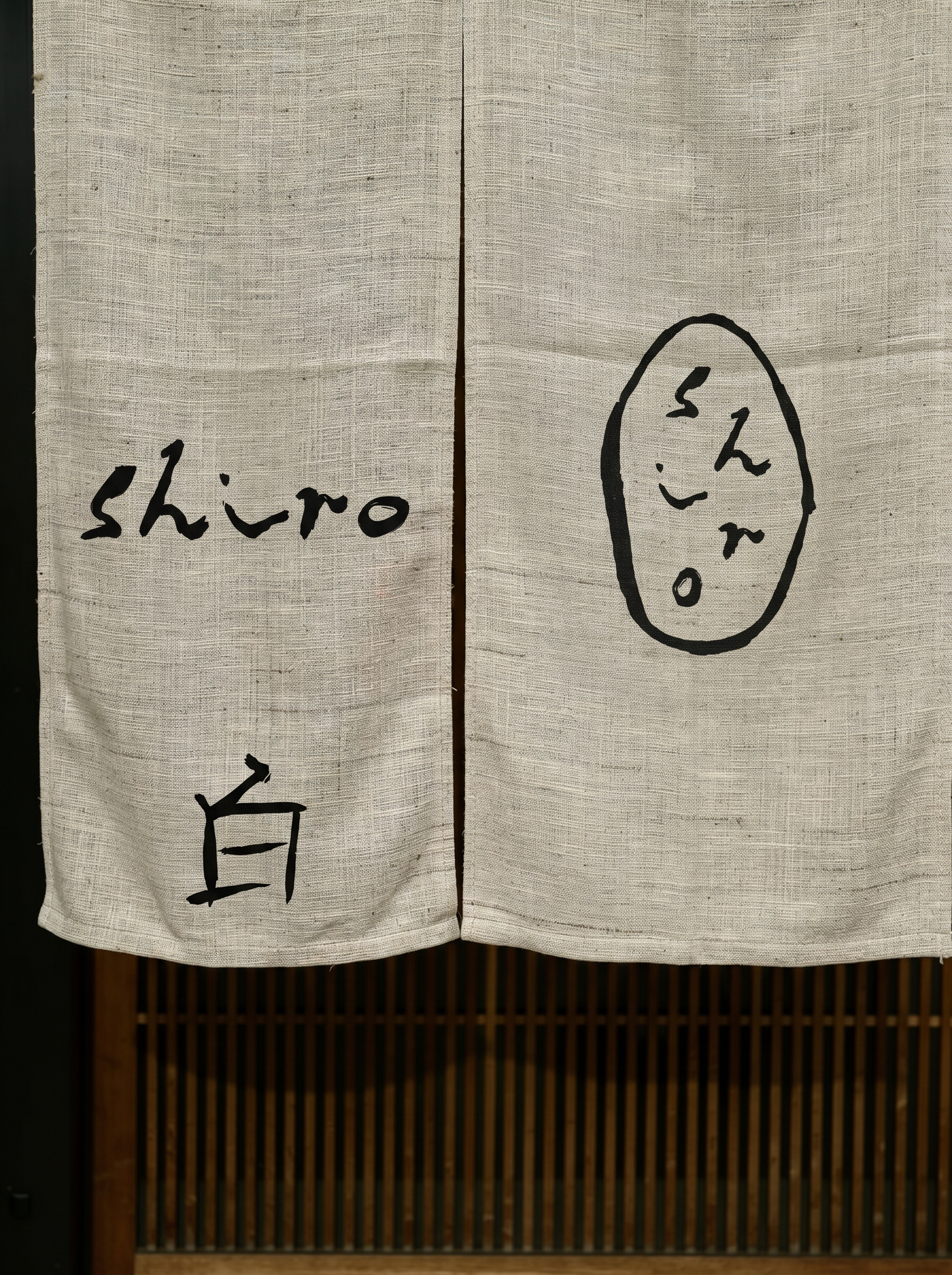
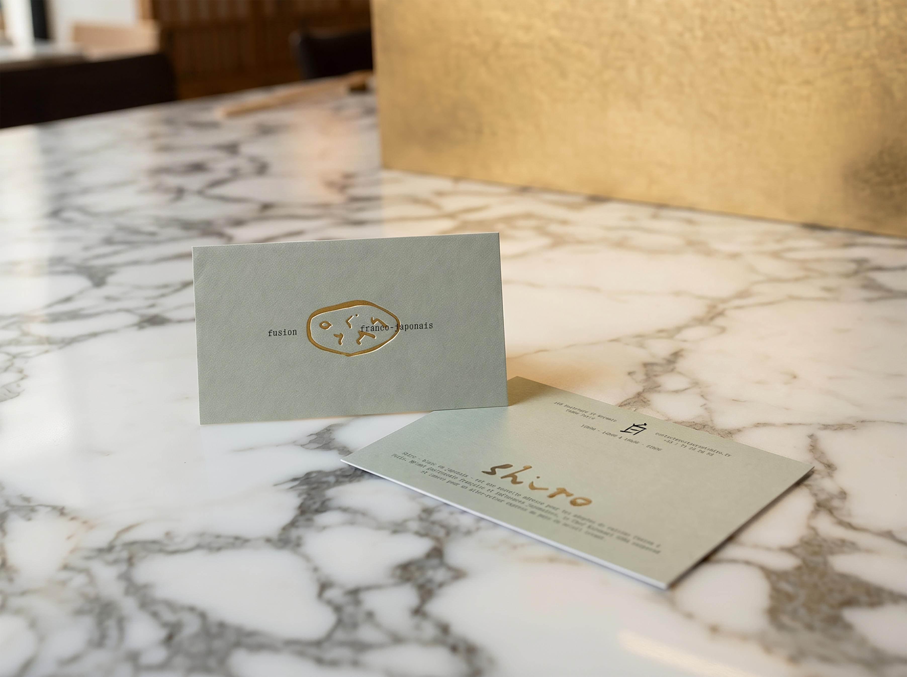
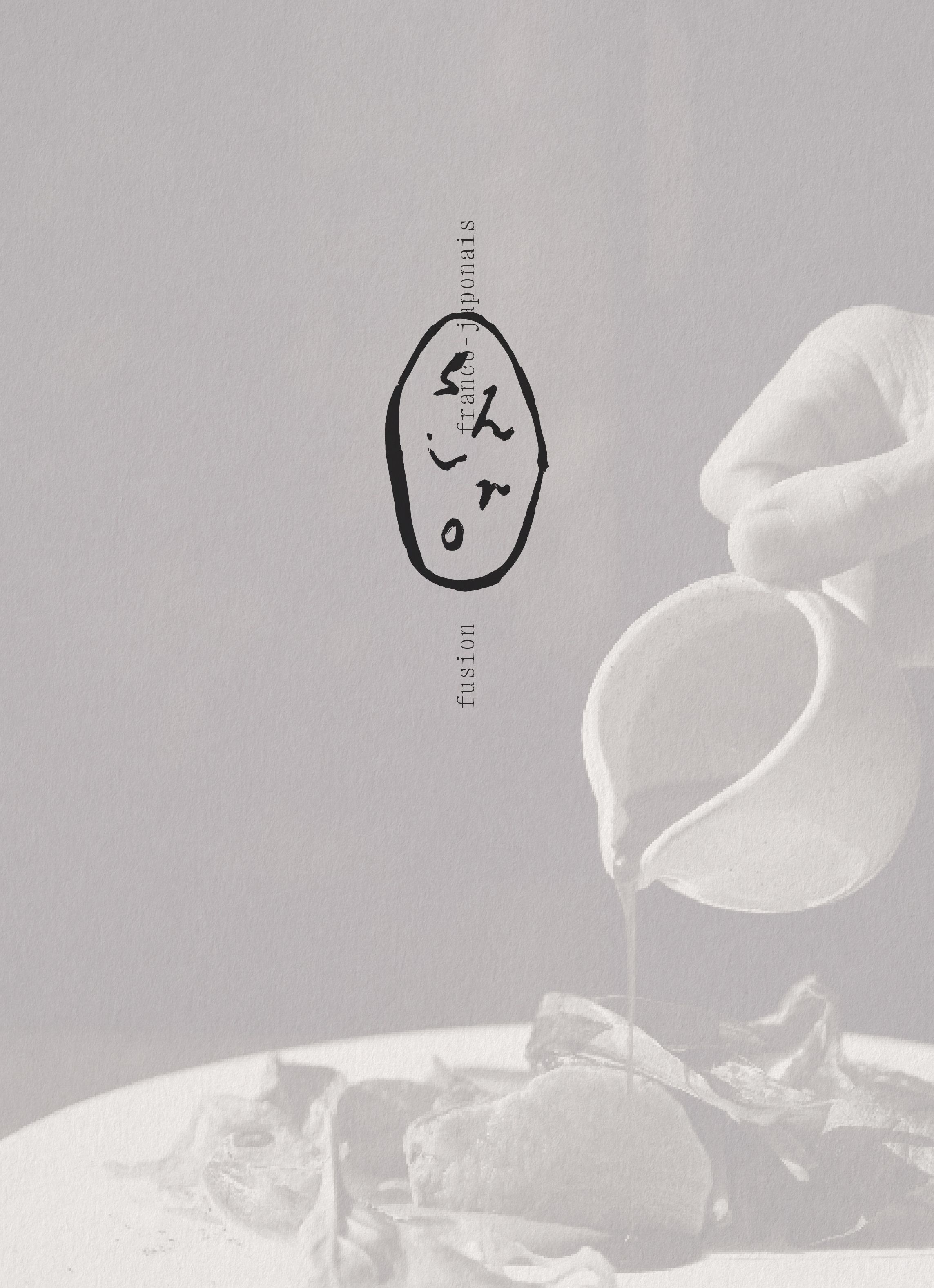
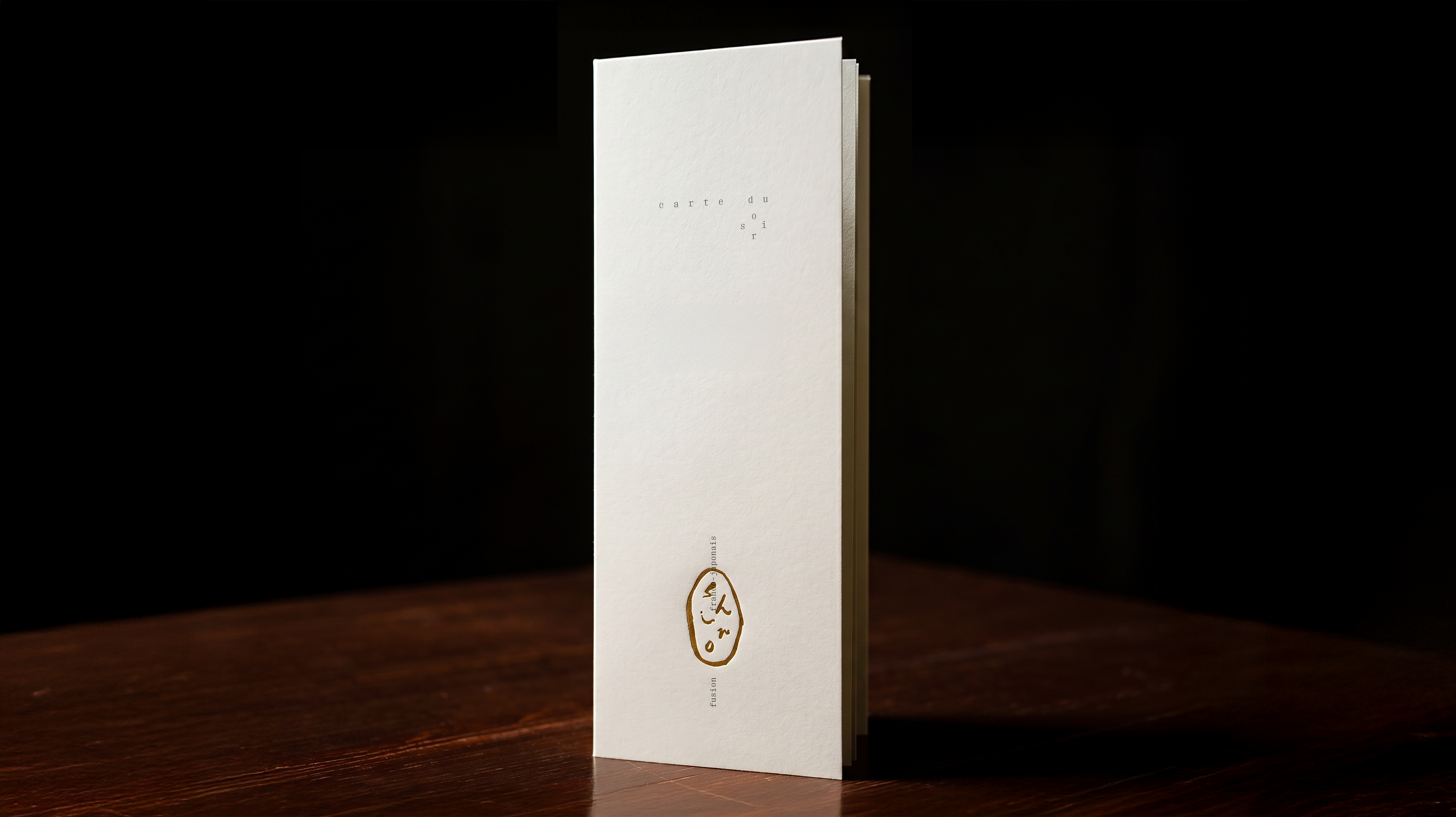
The logo is a loose brushstroke rendering of "shiro" in calligraphy to carry Japanese sensibility, legible enough to feel Parisian. A secondary seal mark encloses the same brushstroke lettering inside a hand-drawn oval, referencing the hanko stamps used in Japanese culture to authenticate and sign.
Personnal visual identity, fictive project © All rights reserved. Reproduction, modification, or commercial use prohibited without prior written permission.